5. Modals
Overview
DomKit provides two classes for creating modal content: Dialog and Popup.
Dialog
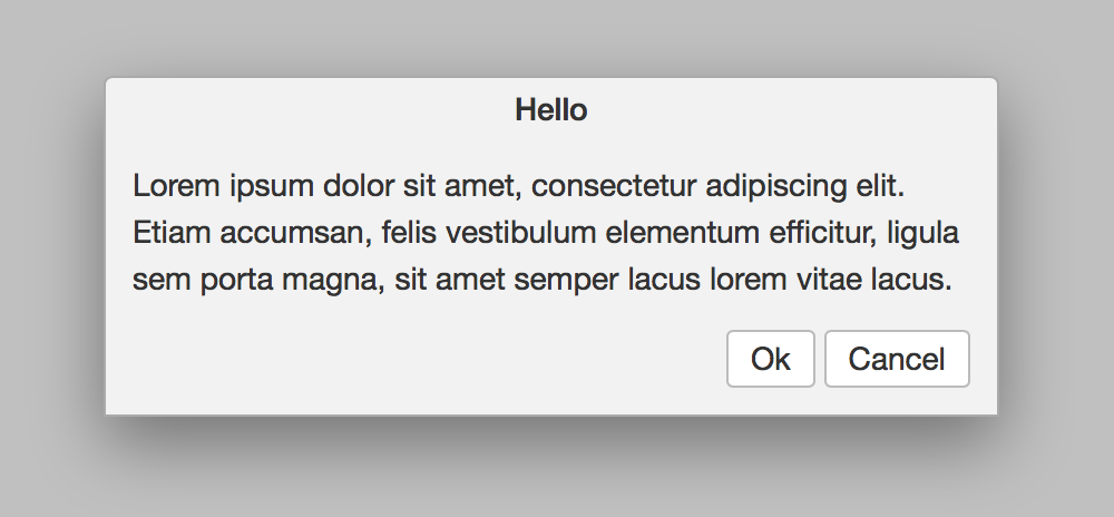
Dialog opens a modal window above page content.
dialog := Dialog { it.title = "Hello" }
dialog.add(SashBox
{
  it.dir = Dir.down
  it.sizes = ["auto", "auto"]
  it.style->padding = "12px"
  Box
  {
    it.text= "Lorem ipsum dolor sit amet, consectetur adipiscing
              elit. Etiam accumsan, felis vestibulum elementum
              efficitur, ligula sem porta magna, sit amet semper
              lacus lorem vitae lacus."
  },
  FlowBox
  {
    it.style->paddingTop = "12px"
    it.halign = Align.right
    it.gaps = ["4px"]
    Button { it.text="OK";     it.onAction { dialog.close; echo("# OK") }},
    Button { it.text="Cancel"; it.onAction { dialog.close; echo("# Cancel") }},
  },
})

dialog.open
To modify the default size of dialog, override the width and height styles:
Dialog
{
  it.style->width  = "600px"
  it.style->height = "400px"
  ...
}
To receive callbacks with Dialog is mounted into and removed from the DOM, use onOpen and onClose:
dialog.onOpen  { echo("Opened!") }
dialog.onClose { echo("Closed!") }
See Dialog for full API details.
Popup
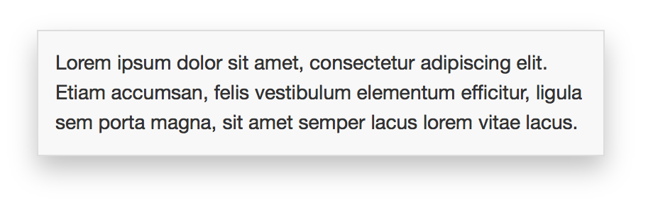
Popup opens a popup window above page content. The popup is dismissed by clicking anywhere outside of the popup, or by pressing the Esc key:
popup := Popup
{
  it.style->width = "400px"
  it.style->padding = "12px"
  Box
  {
    it.text= "Lorem ipsum dolor sit amet, consectetur adipiscing
              elit. Etiam accumsan, felis vestibulum elementum
              efficitur, ligula sem porta magna, sit amet semper
              lacus lorem vitae lacus."
  },
}

popup.open(100, 100)
See Popup for full API details.